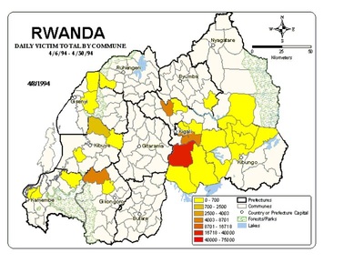
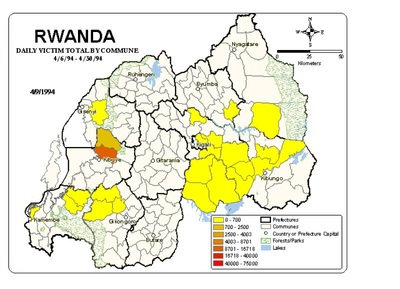
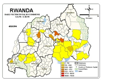
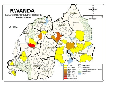
Animations/Films
Essentially, we were interested in understanding who was responsible for violent activities. Toward this end, we had to determine who had effective control over a geographic location (i.e., who had troops in the area and was commonly believed to be in charge of the area). Unfortunately, this type of information was not easy to put together. There has not been systematic work done on identifying exactly who was where in Rwanda during 1994. For our assessments of effective control look here.
How should you view the animation?
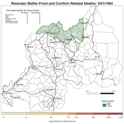
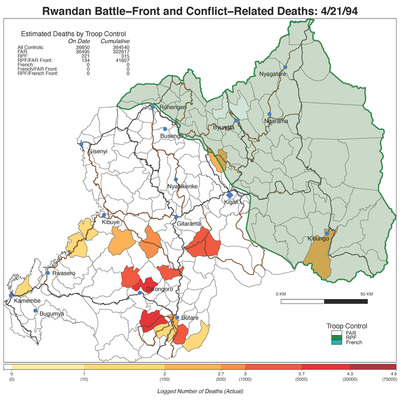
Slowly. To follow the animation, first look at the country to get a general view of the relevant territorial domain. After you have done this, then look for the dark green line - this is the area under the effective control of the Rwandan Patriotic Front (or RPF); these are the Anglophone Tutsi rebels that entered Rwanda from Uganda and fled the country after the violence in the 1960s. The dark green line also identifies the area which constitutes the battle-front between the RPF and the extremist Hutu government in power at the time. The lighter green color corresponds to the territory under RPF control. The area in white represents the territory under control of the extremist government. The area that is light blue corresponds to the territory under the effective control of the French.
As constructed, the animation begins one day before violence ensues (April 6th). After this, the animation advances one day at a time (the date is provided in the upper-right hand corner). In the upper left-hand corner, you will see the estimated deaths that are associated with the different territorial areas of control: one associated with the extremist government (the FAR), one associated with the RPF, one associated with the battlefront between the RPF and the extremist government (RPF front), one associated with the French and one associated with the front between the French and the FAR or RPF.
Animations
- Troop movements without violence
- Troop movements with violence - Median
- Troop movements with violence - High
- Troop movements with violence, Median below 100 killed per day
- Troop movements with violence, Median below 500 killed per day
- Troop movements with violence, Median below 1000 killed per day
- Troop movements with violence, Median above 1000 killed per day
- Troop movements with violence, Median above 5000 killed per day
- Troop movements with violence, Median above 10,000 killed per day
If one prefers to stay away from specific estimations of the violence (i.e. casualty figures), then you could simply view where our estimates do/do not report any violence at all:
Alternatively, one could take the estimations and then parse the values generated into a categorical measure with 5 as the high and 1 as the low (an attempt to generate a measure that is not as specifically tied to casualty estimates but somehow reflects the variation in magnitude). We calculated the probability of falling into each of those categories and provide animations with these:
- Here is an animation with violence dichotomized (yes/no) without troop movements
- Here is an animation with violence dichotomized with troop movements
Alternatively, one could take the estimations and then parse the values generated into a categorical measure with 5 as the high and 1 as the low (an attempt to generate a measure that is not as specifically tied to casualty estimates but somehow reflects the variation in magnitude). We calculated the probability of falling into each of those categories and provide animations with these:
Initial Animations
Our first efforts at animation were quite rudimentary and they were based on our earliest estimations (i.e., before we adopted the Bayes approach outlined above which we viewed as superior). We had just discovered the relevant technology and were still trying to understand what "seeing" the data suggested.
- Early example of just the killing data
- Early example of killing data and troop control (very fast)
- Early example of killing data and troop control (very slow)
- Early example of killing data and troop control over geographic terrain (note at this point we are referring to all killing as genocide)
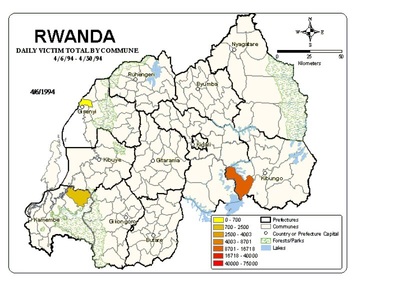
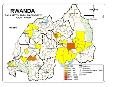
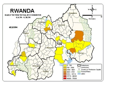
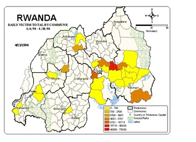
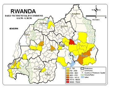
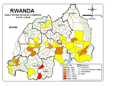
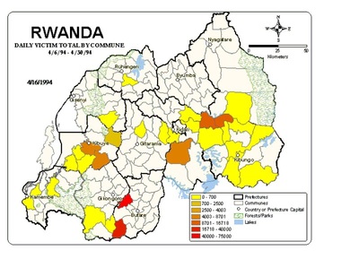
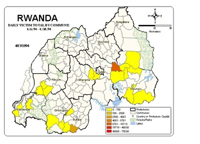
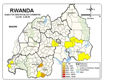
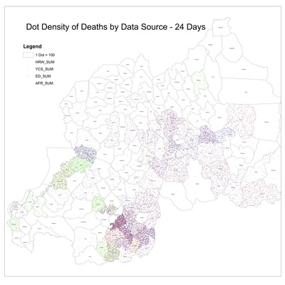
- Early images of first 12 days:

